The Influence of Colors on Space Perception: Minimalist Optimization Through Interior Design
The Impact of Color on Perception and Space
The influence of color extends far beyond mere aesthetics; it can profoundly affect our emotions, moods, and perceptions of space. In the realm of interior design, understanding this interplay becomes critical for creating spaces that resonate with their intended purpose, whether that’s energizing, relaxing, or creating a sense of community. Designers utilize color psychology as a potent tool to manipulate our experiences within a space, transforming ordinary rooms into extraordinary environments.
The Role of Color in Interior Design
When considering color in a design context, it’s important to understand how different hues can shape our behavior and feelings. Here are some pivotal elements of color application:
- Warm Colors: Shades like reds, oranges, and yellows typically invoke feelings of warmth and intimacy. For instance, a warm red dining room can stimulate conversation, making it ideal for family gatherings.
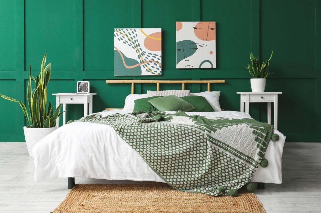
- Cool Colors: In contrast, colors such as blues and greens can create a sense of calm and serenity. A soft blue in a bedroom might promote relaxation and sleep, making it a popular choice for restful spaces.
- Neutral Colors: These hues, including whites, grays, and beiges, serve as versatile backdrops that enhance natural light. They can open a space visually, allowing for a brighter and airier feel, especially in smaller areas where maximizing light is essential.
Minimalist Design Principles
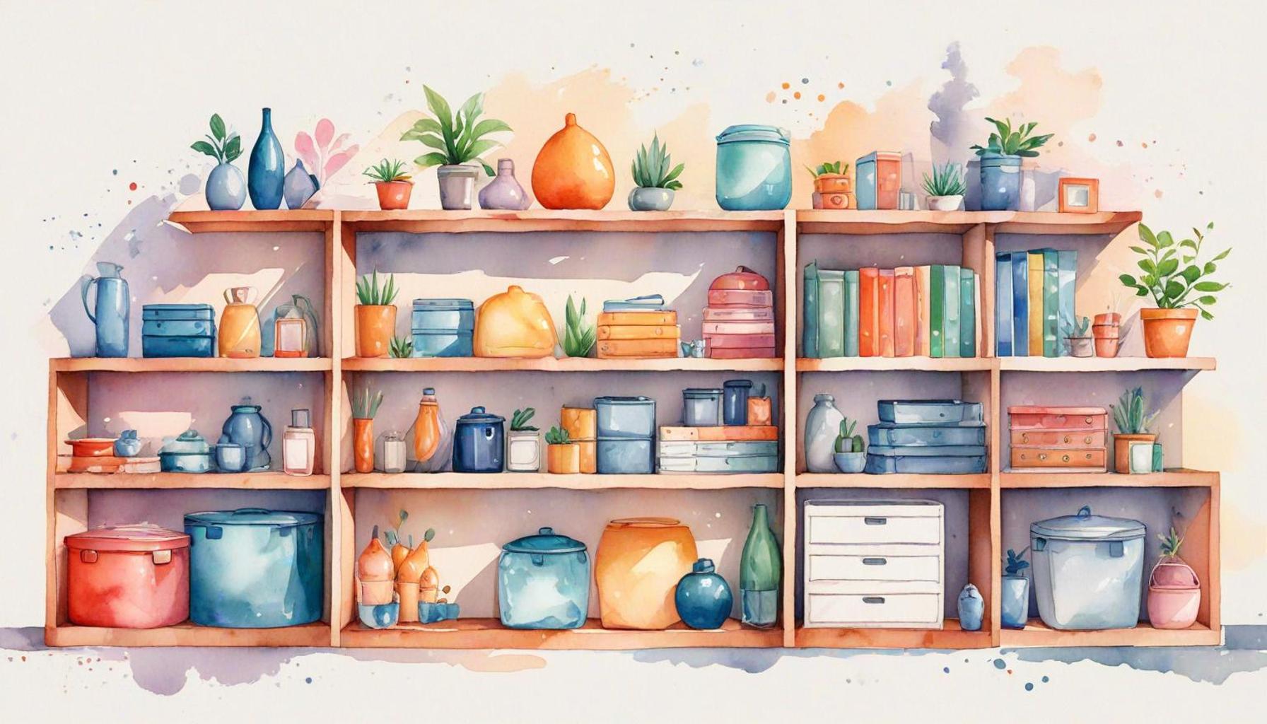
Embracing a minimalist approach in interior design enhances the impact of color while emphasizing simplicity and functionality. This approach rests on several key principles:
- Functional Spaces: Each element within the space should serve a purpose, thereby minimizing visual clutter. For example, a single statement piece of art can draw the eye and serve as a focal point, rather than overwhelming the room with numerous decorative items.
- Harmonized Color Schemes: Selecting a cohesive palette allows for a seamless transition between spaces, which enhances the perception of spaciousness. Shades of white, off-white, or soft pastels can create an illusion of depth and airiness in compact living areas.
- Natural Light Utilization: Optimizing natural light is essential in altering the appearance of colors and enhancing the perception of space. Large windows and strategically placed mirrors can reflect light, amplifying both color vibrancy and overall spatial awareness.
As we explore the compelling intersection of color and design principles, it becomes evident how these elements can dramatically transform your living space. By carefully selecting and applying colors, one can create not only an aesthetically pleasing environment but also a functionally optimized one, tailored to your lifestyle. Such insights invite further investigation into how specific color choices can cater to various unique needs, setting the stage for a rewarding design journey.
DISCOVER MORE: Click here to enhance your personal organization
Understanding the Psychological Effects of Color
Colors are not merely visual elements; they wield the power to shape our interactions with our environments and influence our emotional states. A growing body of research highlights the impact that colors can have on spatial perception—essentially how we interpret and relate to the sizes and shapes of the rooms we inhabit. By examining the psychological effects of color, we find that interior design can be an influential medium for enhancing our experiences within a space.
The Psychological Impact of Color Choices
Colors invoke specific feelings and can be strategically selected to create desired experiences within a room. Consider the following psychology behind various colors:
- Red: Often associated with energy, passion, and excitement, red can evoke strong emotions and stimulate conversation. While it can be invigorating, it’s essential to balance this vibrant color with more muted tones in a minimalist space to avoid overwhelming the senses.
- Blue: A color frequently linked to tranquility and stability, blue can instill a sense of calm and promote concentration. In a minimalist workspace or study, incorporating soft blue tones can enhance focus and productivity while maintaining an open atmosphere.
- Yellow: Known for its cheerful and uplifting qualities, yellow can bring warmth and light into a space. However, as a highly stimulating color, it’s best used as an accent in minimalist designs to add brightness without causing distraction.
- Green: Associated with nature, renewal, and balance, green can create a refreshing ambiance. Its calming effects can be particularly beneficial in bedrooms or relaxation areas, seamlessly integrated into a minimalist theme with plants or green accents.
- Neutral Colors: Hues like white, gray, and beige provide a versatile canvas that can enhance the sense of space in a room. These tones reflect natural light, contributing to a more expansive feel and allowing other colors to shine without competing for attention.
As we delve deeper into the relationship between color and spatial perception, it becomes evident that incorporating these hues mindfully within minimalist designs can lead to enhanced feelings of comfort and functionality. In the context of modern living, where many dwellings are smaller and more compact, exploiting the psychological effects of color can effectively create a sense of spaciousness without compromising on style.
Integrating Color with Minimalist Design
The minimalist philosophy is grounded in the principle of “less is more,” where each piece of decor serves a specific purpose. In this context, color plays an indispensable role. By utilizing a limited color palette, designers can create a harmonious environment that avoids visual chaos, ultimately allowing occupants to experience the space more fully. The rhythmic flow of complementary or analogous colors enhances not only the aesthetic appeal but also spatial awareness.
The implications of color choice in minimalist design extend into various areas, from urban apartments to expansive homes. As such, the potential for creating an inviting, functional, and psychologically pleasing space is enriched exponentially when color is employed thoughtfully. Embracing this understanding can empower both homeowners and designers alike to optimize their environments in response to contemporary demands.
The Role of Color in Interior Design
Color is a fundamental aspect of interior design that shapes our understanding and perception of space. The influence of hues can evoke emotions, alter perception of size, and even shift our mood. For instance, lighter colors generally create an illusion of openness, whereas dark colors may make a room feel smaller and more intimate. This critical understanding of how colors interact with light and space is essential for minimalist optimization, allowing designers to craft environments that maximize aesthetic appeal while maintaining simplicity.
Psychological Effects of Different Colors
Each color invokes its own psychological effects. For example, blue hues are often associated with tranquility and calmness, making them an excellent choice for bedrooms or relaxation spaces. In contrast, red can stimulate energy and passion, potentially serving well in social areas such as living rooms or dining spaces. Designers utilize these psychological impacts to create environments that foster productivity, creativity, or relaxation, depending on the intended use of the space.
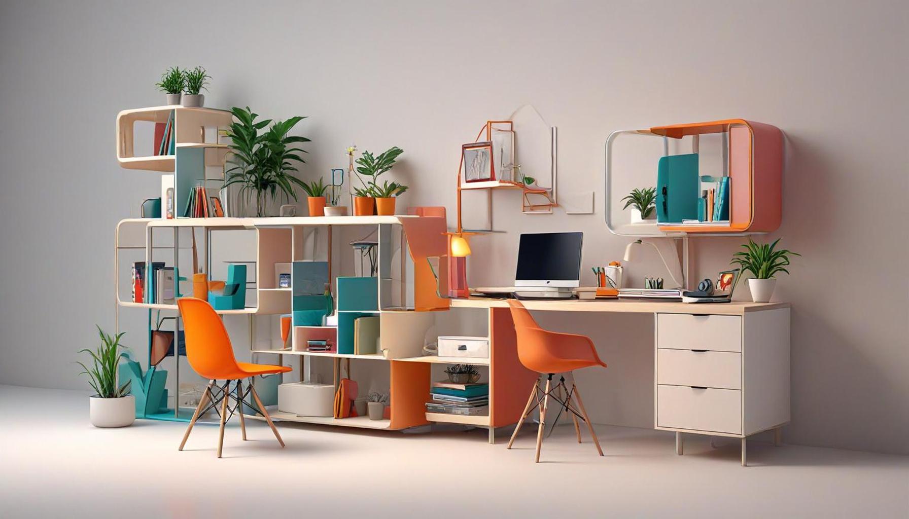
Minimalism and Color Selection
In the realm of minimalist design, where the focus is on reducing clutter and emphasizing functionality, color selection becomes paramount. Enticing palettes, often consisting of muted tones, help maintain a serene atmosphere while maximizing visual harmony. These carefully curated color schemes not only enhance the spatial perception but also complement the minimalist philosophy by creating spaces that feel open and inviting without overwhelming the senses.
Using Color to Define Spaces
Color can also serve as a subtle partition in open-plan environments. By employing different shades or contrasting colors, interior designers can delineate functional areas without the use of physical barriers. This technique encourages a smooth flow between spaces while maintaining a cohesive aesthetic that aligns with the principles of minimalist design.
Practical Applications of Color in Minimalist Design
Practically applying color in minimalist design involves selecting a few key shades that can traverse multiple rooms, fostering continuity throughout a residence. For instance, a soft palette featuring whites, greys, and pale pastels can unify spaces and offer a backdrop for bold accents, serving functional and decorative purposes. This approach encourages homeowners to thoughtfully incorporate color in their designs while ensuring that spaces remain uncluttered and purposeful.
The Symbolism of Color in Minimalist Optimization
Finally, incorporating color involves understanding its symbolism in various cultures, ensuring the design resonates with its inhabitants. Cultivating awareness of cultural nuances surrounding color can enhance the overall design experience, thereby enabling personalized and impactful interior spaces that marry aesthetic and functionality seamlessly.
| Advantage | Description |
|---|---|
| Spatial Illusion | Lighter colors enhance the perception of openness and space. |
| Mood Enhancement | Carefully chosen colors can influence emotional responses and well-being. |
DISCOVER MORE: Click here to uncover valuable strategies
Color Theory in Minimalist Settings
In the realm of interior design, color theory can be a powerful tool for transforming perceptions of space. From creating illusions of depth to managing light and shadow, choosing the right colors can significantly alter how we perceive a room’s dimensions. The basic principles of color interactions provide insights into how certain combinations can effectuate considerable changes in spatial perception.
Illusion of Space through Color Contrast
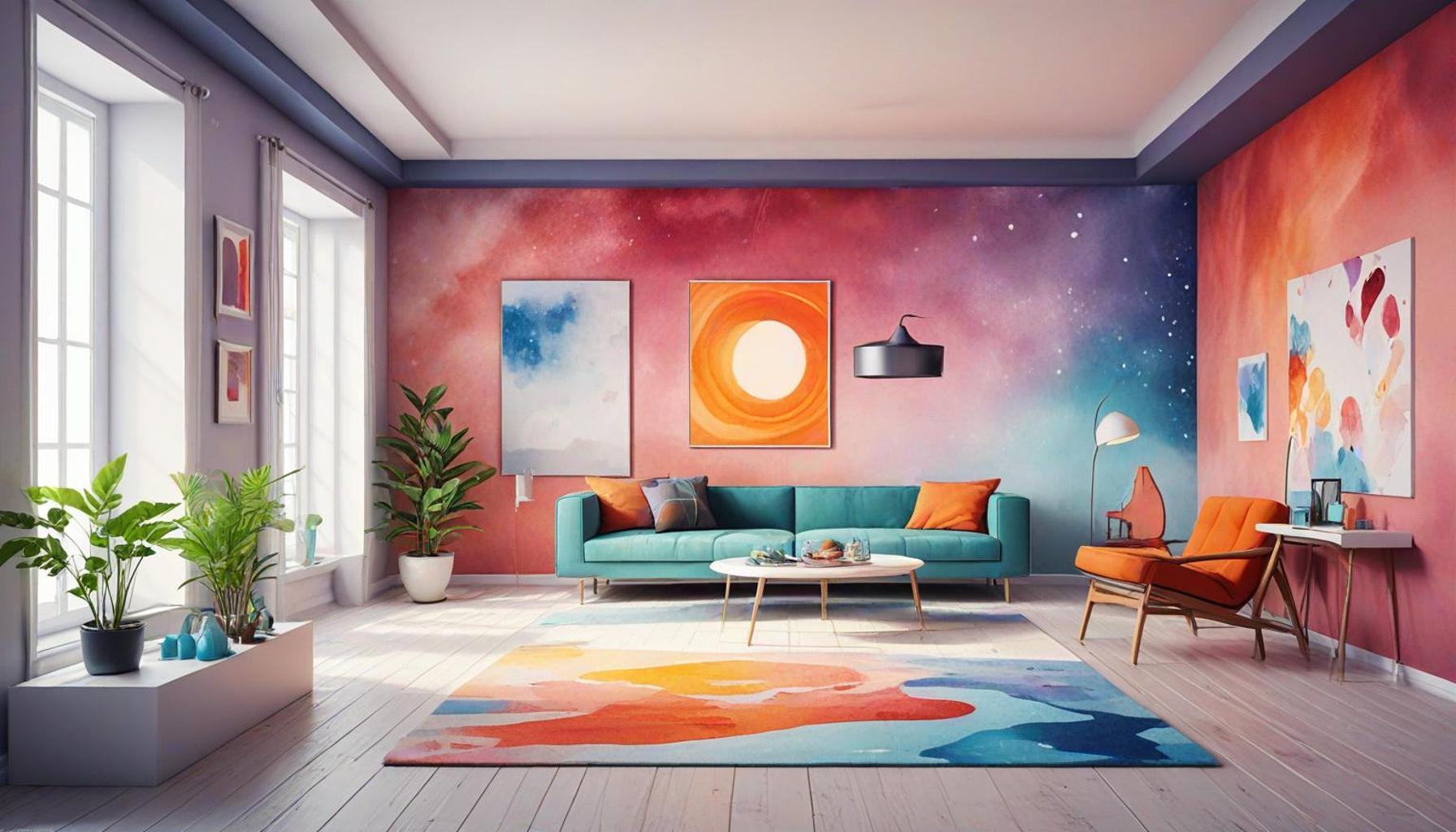
A fundamental aspect of color theory lies in the effective use of contrast. High contrast colors can serve to delineate areas within a space, which is particularly useful in minimalist design where the clutter is minimized. For example, pairing a dark accent wall with lighter surrounding decor creates a striking focal point, bringing depth to the visual experience without overcrowding the sensory environment. This contrast, in turn, can make a room feel larger by drawing the eye toward particular features rather than allowing it to wander aimlessly across overwhelming decor.
Moreover, softer contrasts can enhance a room’s serenity. A transition from soft whites to pale grays can blurring walls, creating an ethereal effect that gives a feeling of openness. Utilizing gradients can replicate the effect of natural light at different times of the day, thus rendering the space dynamic without clutter. Many minimalist designers, when applying this technique, take into account the direction of incoming light. For instance, a warm north-facing room can benefit from cooler shades to maintain a cozy atmosphere, while a south-facing space can utilize cooler hues to balance the intense sunlight.
Leveraging Color to Enhance Movement and Flow
Beyond creating the illusion of space, colors can also guide the flow of movement within a room. In minimalist interiors, where harmony is key, colors can act as visual pathways. For example, using a consistent color palette across adjacent rooms can create a cohesive visual line, subtly directing the observer’s attention from one area to the next. This unbroken sequence can lead to an enhanced spatial experience, allowing occupants to feel as though the space is more extensive and interconnected.
Additionally, applying principles of color psychology can enhance this flow. Thoughtfully chosen accent colors at strategic points can trigger emotional responses as individuals move through a space. For instance, a soft blue hallway leading to a vibrant yellow living room can evoke feelings of tranquility followed by joy, engaging the occupant throughout their journey in the home.
The Role of Texture and Finish in Color Perception
The perception of color is further influenced by texture and the finish of materials used within the space. In minimalist design, materials often have a significant impact on the perceived quality of a color. A matte finish, for instance, can absorb light, which may render colors in muted tones, creating a tranquil and sophisticated atmosphere. In contrast, a glossy finish can reflect light, amplifying vibrancy and creating a lively ambiance.
For example, using a matte beige wallpaper paired with glossy white trim can create a soothing yet vibrant environment, striking a balance that encapsulates minimalism while delivering strong aesthetic appeal. Consideration of these aspects might seem intricate, but when applied skillfully, they play a crucial role in enhancing spatial perception, allowing for an experience that feels expansive and inviting even in smaller footprints.
As designers continue to explore the psychological impact of colors within minimalist settings, the importance of combining color, texture, and spatial arrangement becomes increasingly apparent. This thoughtful integration offers homeowners a method to optimize their spaces, demonstrating that simplicity can yield profound effects on how we perceive and engage with our surroundings.
DISCOVER MORE: Click here to learn about intentional purchasing in minimalist living
Conclusion: The Power of Color in Minimalist Interior Design
In the exploration of color theory within the context of minimalist interior design, it becomes evident that color choices significantly influence our perception of space. By understanding how contrasting hues, soft gradients, and strategic color palettes can create emotional and spatial experiences, designers can transform a simple room into an expansive, harmonious sanctuary. From enhancing depth with dark accent walls to using texture to affect vibrancy, the meticulous selection of colors is essential for achieving a calming and expansive atmosphere.
The concept of color as a guiding tool for movement and flow invites us to consider the journey individuals embark upon within a space. Integrating principles of color psychology allows for the modulation of emotions, harnessing the power of colors to evoke feelings—tranquility, joy, and more—as we navigate through our environments. The seamless flow created by a consistent color scheme across rooms bolsters a sense of connectedness that is intrinsic to the minimalist philosophy.
As we delve deeper into the relationship between color, texture, and space, it becomes clear that the art of minimalist optimization is not merely about reducing clutter but about intelligent design that speaks to our senses. Homeowners across the United States and beyond are encouraged to embrace these principles in their spaces, unlocking the potential to enhance their daily experiences. In this pursuit of simplicity, the strategic use of color emerges not just as a choice but as an essential element that shapes our perceptions, demonstrating that even within minimalism, the impact of colors can be profoundly transformative.